Meraki
Services
Branding | Website | Mailing
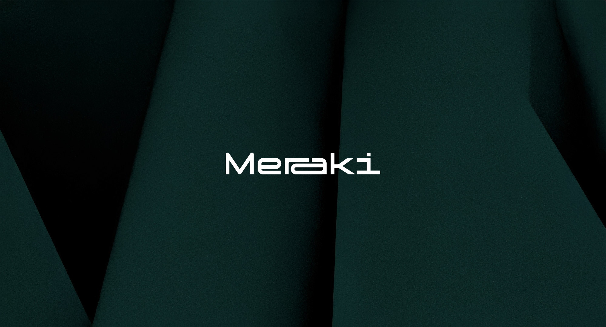
A bold, adaptable rebranding that fits Meraki like a perfectly designed workspace
Meraki transforms offices into vibrant, people-centered environments. Their brand, however, felt a little... cramped. Time for a refresh! I reimagined their identity with a versatile logo, a refined typographic system, and the slogan "Spaces That Fit"—because just like their designs, a brand should adapt to its space.
Designing a brand as smart and adaptable as their work
Meraki specializes in creating workspaces that energize culture and maximize potential. They wanted a stronger, more engaging identity that would set them apart—while keeping their signature yellow and single-line illustrations.


A dynamic logo that moves with the space around it
The new typography stretches, compresses, and adapts—just like Meraki’s approach to space. Stronger, clearer, and more memorable.


The result:
A structured, personality-filled identity
Meraki’s branding now feels as smart and adaptable as the spaces they create—bold where it matters, flexible where it counts.
Selected Works
You scrolled all the way here?
I like your style.
 Bonus points for curiosity
About | Work

Just saying—my inbox is always open.
© Laurent Parisel 2025 | Privacy & Policy