Stirrr
Services
Branding | Website | Packaging
A Brand as Flavorful as Its Spices
Stirrr is all about adding a kick to your favorite beverages and dishes with unique spice blends that enhance both taste and well-being. To match its vibrant products, the brand needed a strong, character-filled identity—one that dares to break the mold.
A Bold Inspiration Straight from the 60s
The madness and emancipation of the 60s perfectly capture the spirit of Stirrr: dynamic, stylish, and full of personality. These iconic years became the foundation of our graphic exploration. Through moodboards and design research, we developed a vintage-inspired identity with bold typography and high-contrast colors that embody the brand’s energy.


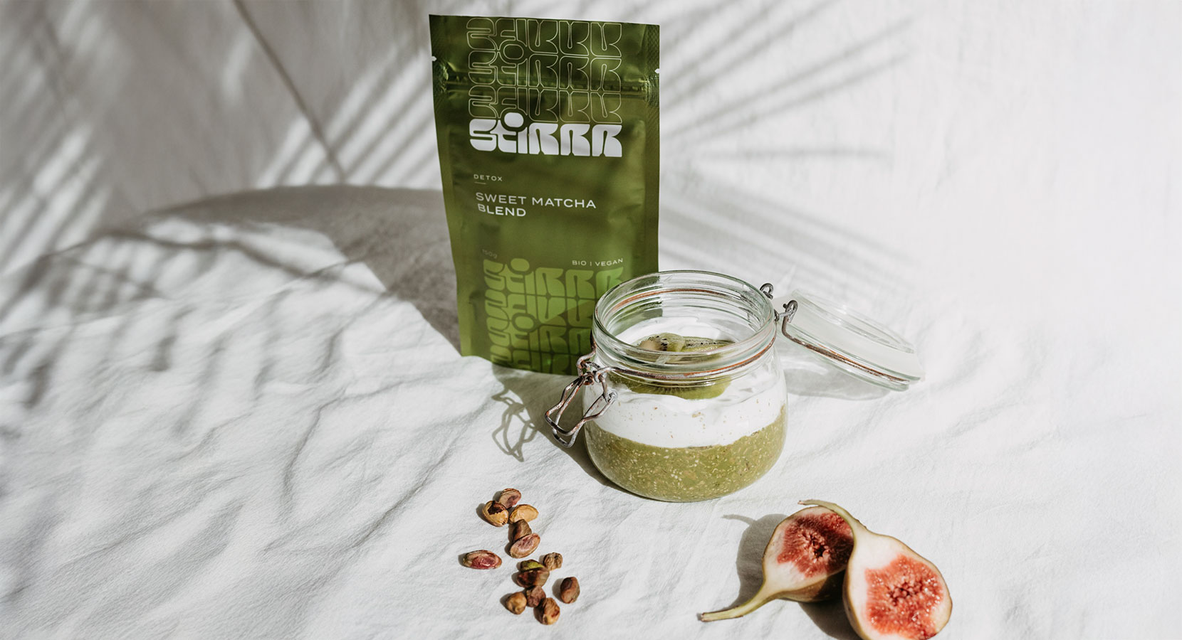
A Wide Range of Colorful Products
Color, and lots of it! Bland packaging was never an option. Each spice blend deserved its own distinct, eye-catching look, making it stand out on the shelves. A thorough color study was conducted to ensure the perfect match between the blend’s essence and its visual identity. Contrasting and harmonious palettes were carefully crafted to enhance the brand’s playful and engaging feel.


The result:
A bold, flavorful brand that stands out—just like its spices.
With a daring identity, a colorful product line, and a seamless digital experience, Stirrr spices up not only food and drinks but also the visual landscape of its industry.
Selected Works
You scrolled all the way here?
I like your style.
 Bonus points for curiosity
About | Work

Just saying—my inbox is always open.
© Laurent Parisel 2025 | Privacy & Policy